A Lick of Paint
I've decided it's time for change. I've been using the same base eleventy template for this blog since it's inception. I personally don't have anything wrong with it, I actually quite like it, but I feel like I had to make it a bit more me. I'm not gutting the blog and giving it a complete overhaul, merely giving it a lick of paint.
Colours
Starting with the colours, I've decided to go for a deep racing green as the primary colour for the blog. In the last few years green has really jumped up as my favourite colour, previously it was blue for most of my life. The colour green itself emanates a calming radiance, which is the tone I want to set for my little corner of the internet. It should feel like you're taking a breather from life sitting on a grassy field on a warm summer's day with the sun gently radiating on your skin, letting the concept of time and life merely fly past.
For the accent, I went for a golden brown to complement the earthy tones. I actually took inspiration for this colour combination from one of my favourite cars, a Porsche 911 in British Racing Green.
The New
The Old
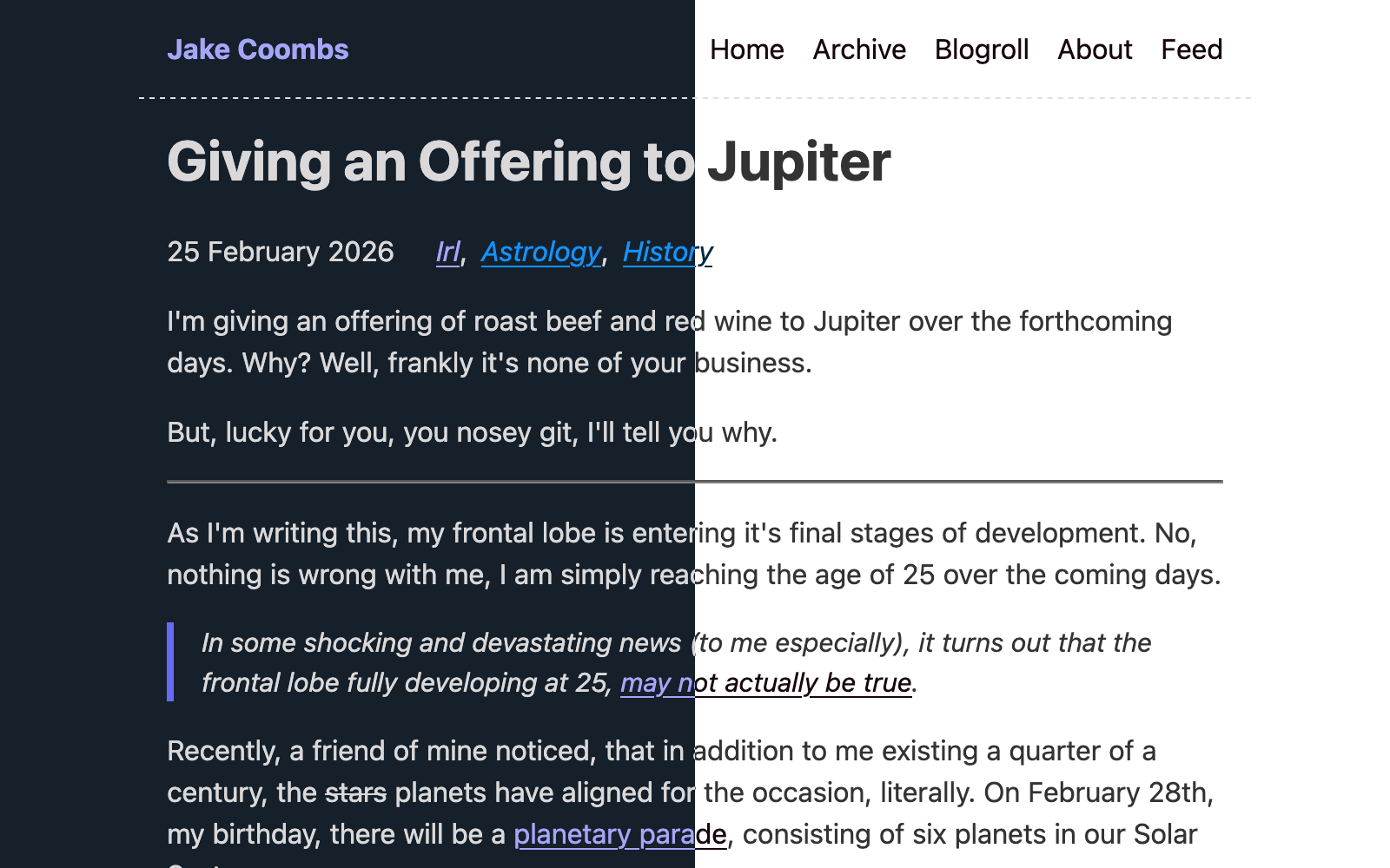
I debated removing the light theme and having just the one theme, however, personally I quite like to have applications in light mode during the day in line with sunrise and sunset. I'm a bit of a freak like that when you compare to the modern expectations for everything to be in dark mode.
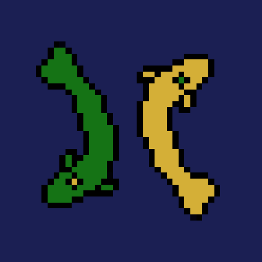
An Icon
In addition to some new colours, I need a logo for the site, I couldn't leave the blog without a favicon, it just feels unpolished
A favicon is the icon for the site that you see on the tab of the site or in the bookmarks section, but more importantly in the RSS feeds.
An icon/logo is one of the most personal things about a site in my opinion. Even though it is literally a tiny part, I think it sets the tone of the site; is it serious, is it personal, is it a brand? I wanted the icon of my site to be personal, the blog is an extension of me as it is literally my thoughts and words shared for anyone to access, so the icon should represent me.
So what represents me? I'm glad you asked. I am personally a strong believer in both the principle of karma, and Yin and Yang. Following the principle of karma, I truly believe that whatever you put into your life will come back to you eventually, even if it may not be immediate. And the Yin and Yang represents that life is made up of opposite forces which are interconnected and bring a balance to life. Using these, I want to have my own interpretation of the Taijutu symbol.
As revealed in Giving an Offering to Jupiter, I am a Pisces, which is represented by the two fish, it is something that I have somewhat of a strong connection to, and I feel it represents me strongly. Combining two fish and the Taijutu symbol is something that already exists in Chinese culture , with fish symbolising abundance, prosperity and good fortune. I actually have a t-shirt with this combination on it that I picked out specifically when I saw it.
Instead of using an existing image created by someone else, I wanted to try my hand at some digital art to put my own signature on the logo, something unique to me. I chose to go for a pixel-art style for the design, partially because you could say that it represents the digital version of myself, but more importantly because it was the easiest method for me. Of course I had to align the colours to match that of the new colour scheme too, but I had to brighten the colours to make them pop a bit more at a small size, so it's they're not exactly the same which I'm not sure how I feel about, I might come back to change that.
I created the image using Gimp and went through a few versions before I was happy with the result. It took me a while to realise that I could actually flip the fish around so that they represent my initials "JC" which I thought was pretty cool.
Overall, I'm a lot happier with how this digital space looks now, it definitely feels more me, and that will do.
- ← Previous
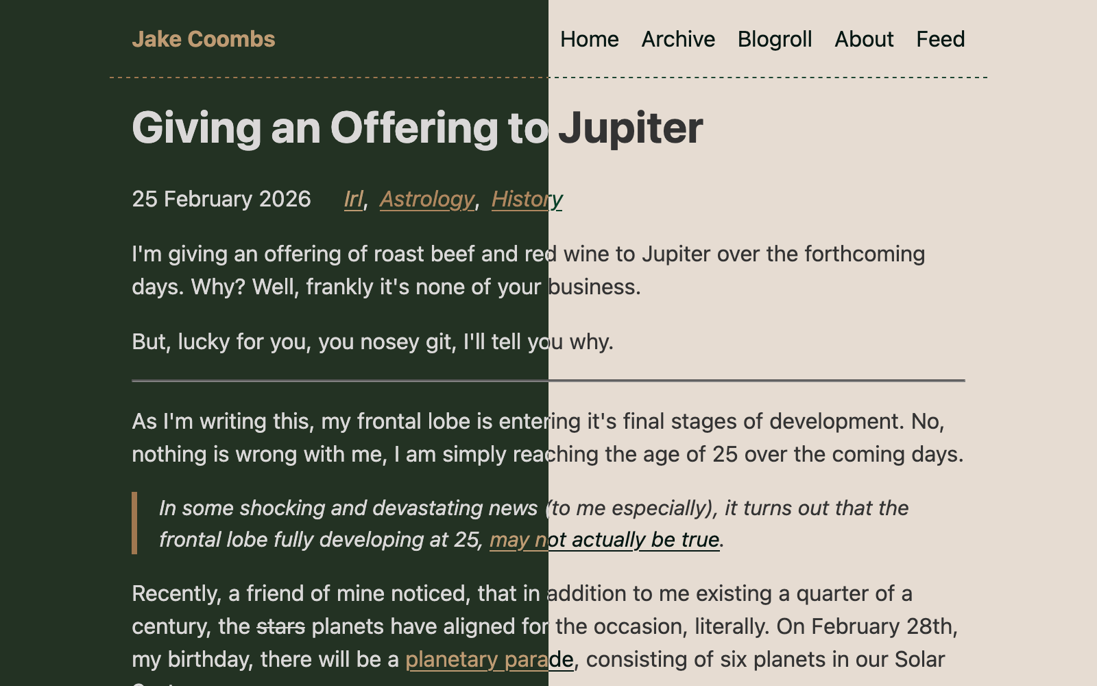
Giving an Offering to Jupiter